The digital landscape is shifting rapidly, with more than 60% of global internet traffic now originating from mobile devices. For small business owners, this presents a golden opportunity—and a critical challenge. A poor mobile user experience can lead to lower conversions, frustrated users, and lost revenue. This guide will walk you through expert-level strategies to optimise your website for mobile-first Conversion Rate Optimisation (CRO), ensuring you stay ahead of the competition.
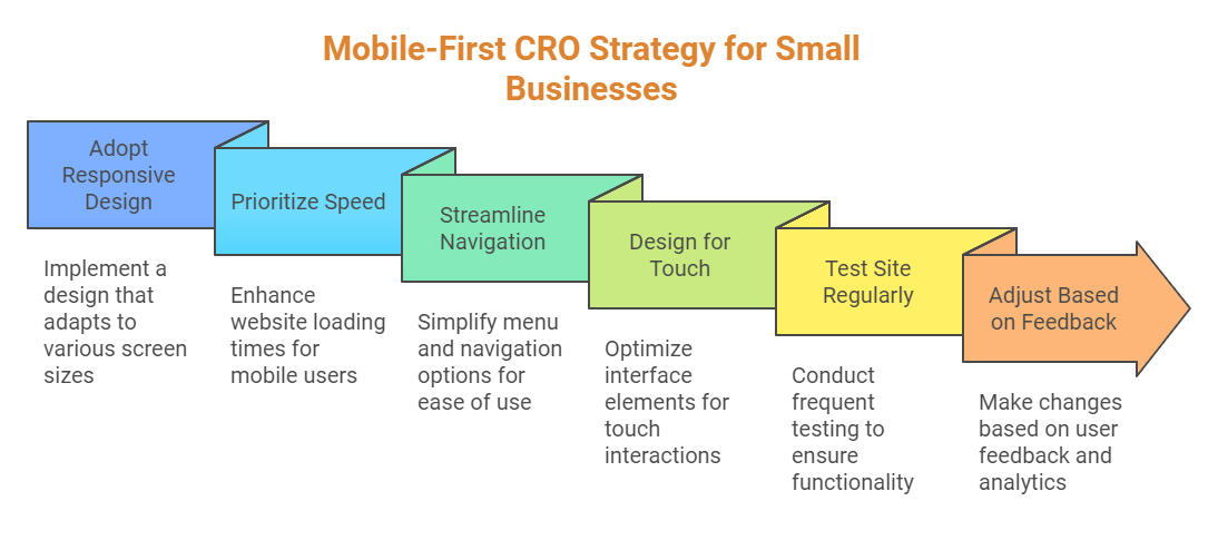
Step 1: Choose a Mobile-Friendly Design
At the heart of mobile-first CRO lies a responsive design. A responsive website adapts seamlessly to different screen sizes and orientations, ensuring a consistent user experience across devices. Not only does this enhance usability, but it also boosts your search engine rankings, as Google prioritises mobile-friendly sites in search results.
Key benefits of responsive design include:
- Improved user experience
- Higher search engine visibility
- Reduced bounce rates
If your website isn’t responsive yet, consider switching to a mobile-first theme or hiring a developer to make the necessary updates. For WordPress users, themes like Astra or GeneratePress are excellent starting points.
Step 2: Optimise Page Load Speed
Mobile users expect websites to load in under one second. According to a study by Google, a one-second delay in load time can reduce mobile conversions by up to 20%. Speed is non-negotiable for mobile-first CRO.
Actionable Tips to Improve Page Speed:
- Compress images using tools like TinyPNG.
- Enable lazy loading for images and videos.
- Eliminate unnecessary JavaScript and CSS files.
- Use caching plugins like WP Rocket for WordPress.
- Test your site with Google’s PageSpeed Insights.
“A fast-loading website isn’t just a luxury—it’s a necessity for keeping mobile users engaged and driving conversions.” – Neil Patel, Digital Marketing Expert
Step 3: Streamline Navigation
Mobile navigation should be intuitive and effortless. Complicated menus and cluttered layouts can frustrate users and lead to high bounce rates. Instead, focus on simplicity and usability.
Best Practices for Mobile Navigation:
- Use a hamburger menu to save space.
- Adopt a single-column layout for easy vertical scrolling.
- Place essential links and CTAs within thumb-friendly zones.
Ensure your navigation highlights core pages, such as product offerings, contact information, and your blog. For more on website usability, check out our guide to improving website usability.
Step 4: Design for Thumbs and Fingers
Mobile users interact with their devices differently than desktop users. Designing for touch is critical. Interactive elements like buttons and links must be large enough to tap easily, even on smaller screens.
Key Guidelines for Touch-Friendly Design:
- Ensure buttons are at least 48×48 pixels.
- Position CTAs at the bottom centre of the screen for easy access.
- Add sufficient spacing between clickable elements to prevent accidental taps.
Remember, a seamless touch experience can significantly improve user satisfaction and drive conversions.
Step 5: Optimise Content for Mobile Users
Content that works on desktop doesn’t always translate well to mobile. Mobile users prefer concise, scannable, and visually engaging content. Long-winded paragraphs and complex language should be avoided.
Content Optimisation Tips:
- Break text into short paragraphs (2-3 sentences).
- Use bullet points and numbered lists for readability.
- Incorporate subheadings and images to break up text.
- Avoid jargon unless it’s essential to your audience.
For more advice on crafting mobile-friendly content, explore our content creation tips for small businesses.
Step 6: Optimise Forms and CTAs
Forms and calls-to-action (CTAs) are pivotal to CRO. However, poorly designed forms can deter users from completing the desired action. Keep them simple and mobile-friendly.
Form Optimisation Tips:
- Minimise the number of required fields.
- Use auto-fill options for common fields.
- Ensure buttons are large, clear, and easy to tap.
Additionally, test your forms frequently to ensure they work seamlessly across all devices.
Step 7: Eliminate Flash and Pop-Ups
Flash is outdated and unsupported on most mobile devices. Similarly, intrusive pop-ups can disrupt the user experience and lead to higher bounce rates. Instead, use HTML5 for multimedia content and opt for non-intrusive, easy-to-dismiss pop-ups.
For compliance with Google’s guidelines, ensure pop-ups don’t cover the entire screen and are used sparingly.
Step 8: Test and Iterate
Mobile optimisation is an ongoing process. Regular testing helps identify issues and improve the user experience. Use tools like Google’s Mobile-Friendly Test to evaluate your site’s performance.
Steps to Test Effectively:
- Test on real mobile devices, not just emulators.
- Gather feedback from users to identify pain points.
- Continuously update and improve based on analytics data.
Remember, a well-tested site is a high-performing site.
Conclusion: Take Action Today
Optimising your small business website for mobile users is no longer optional—it’s essential. By implementing a mobile-first CRO strategy, you can improve user experience, boost conversions, and gain a competitive edge in your industry.
Start by adopting a responsive design, prioritising speed, streamlining navigation, and designing for touch. Test your site regularly and make adjustments based on user feedback and analytics. With these strategies, your small business website will be ready to meet the demands of today’s mobile-first world.
Ready to take your website to the next level? Explore our mobile optimisation services or contact us for a free consultation.